「標準のボタンはデザインがいまひとつだな...」っと感じるあなたに。
プラグイン不要で実装できる おしゃれなボタン装飾 のサンプル集をご紹介します。
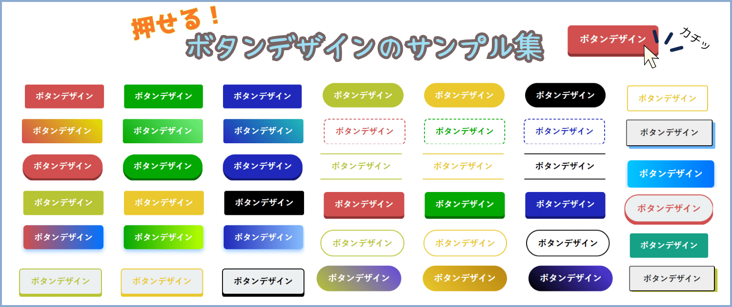
当サイトでは、コピペだけで設置可能な、ボタン装飾を140種類以上用意しました。
マウスオーバー効果や立体感など、クリック率を高める工夫が満載で、初心者に大好評の記事になっているので、興味のある人はぜひ読んでみてください。
ボタンを設置する手順
まずは、WordPress 記事に「カスタマイズしたボタン」を追加する方法からお伝えします。
もちろんプラグインは不要。次の手順でテーマに関係なく適用できます。
- WordPressの投稿画面を開く
- 「カスタムHTML」を挿入する
- 本記事のサンプルコードをコピペする
- リンク先のURLを書き換える
- 「カスタムHTML」をブロックに変換する
次のボタンをタップすると、画像ベースで分かりやすい手順を表示できます。
もっと詳しい手順を見る
STEP
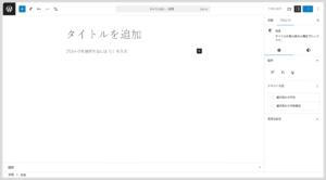
WordPress の投稿画面を開く
まずは、WordPress の管理画面にログインして「投稿画面」を表示しましょう。

STEP
「カスタムHTML」を挿入する
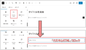
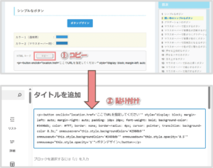
投稿ページを開いたら、画面左上の  ボタンをクリックします。

ブロックリストが表示されたら「カスタムHTML」を選択して、カスタムHTMLブロックを挿入しましょう。

STEP
サンプルコードをコピペする
次に、本記事で紹介するボタンデザインのをコピーして、WordPress 投稿画面の「カスタムHTML」に張り付けます。

⇒ボタンデザイン集をチェック!
STEP
リンク先のURLを書き換える
「カスタムHTML」に HTMLコードをコピーしたら、ボタンクリック時に遷移するリンク先を指定します。
例)https://takarogu.com を指定して、本サイトのトップページに遷移させる場合は、次のようにコードを書き換えます。
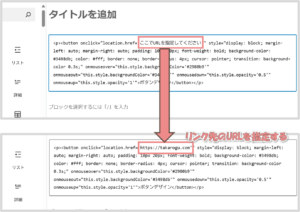

リンク先を指定したら、プレビューで正しく遷移するか確認してみましょう。
STEP
「カスタムHTML」をブロックに変換する
最後に「カスタムHTML」をブロックに変換します。
「カスタムHTML」を選択した状態で「︙」をクリック。「ブロック変換」を選択してください。
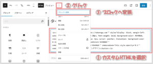

カスタムHTMLがブロック化され、ボタンイメージに切り替われば完了です。
ボタン上のテキストは自由に変更できるので、お好みの文言に書き換えてください。

ここからは、ボタンのサンプルデザインをご紹介していきます。
お好みのカラーを選んで、コードをコピペするだけで簡単に適用できるので、ぜひ使ってみてください!
シンプルなボタン
カラー1(通常時) :
カラー2(マウスオーバー時):
<p><button onclick="location.href='ここでURLを指定してください'" style="display: block; margin-left: auto; margin-right: auto; padding: 10px 20px; font-weight: bold; background-color: #3498db; color: #fff; border: none; border-radius: 4px; cursor: pointer; transition: background-color 0.3s;" onmouseover="this.style.backgroundColor='#2980b9'" onmouseout="this.style.backgroundColor='#3498db'" onmousedown="this.style.opacity='0.5'" onmouseup="this.style.opacity='1'">ボタンデザイン</button></p>
サンプルカラー
カラー1:#d14f4f
カラー2:#b44343
カラー1:#04a803
カラー2:#048303
カラー1:#1f28ba
カラー2:#181f88
カラー1:#b7c433
カラー2:#99a428
カラー1:#eac82e
カラー2:#c5a828
カラー1:#000000
カラー2:#575757
囲い枠のシンプルなボタン
カラー :
<p><button onclick="location.href='ここでURLを指定してください'" style="display: block; margin-left: auto; margin-right: auto; padding: 10px 20px; background-color: transparent; font-weight: bold; color: #3498db; border: 2px solid #3498db; border-radius: 4px; cursor: pointer; transition: all 0.3s;" onmouseover="this.style.backgroundColor='#3498db'; this.style.color='white'" onmouseout="this.style.backgroundColor='transparent'; this.style.color='#3498db'" onmousedown="this.style.opacity='0.5'" onmouseup="this.style.opacity='1'">ボタンデザイン</button></p>
サンプルカラー
グラデーションのボタン
カラー: ⇒
<p><button onclick="location.href='ここでURLを指定してください'" style="display: block; margin-left: auto; margin-right: auto; padding: 10px 20px; font-weight: bold; background: linear-gradient(45deg, #e67e22, #e74c3c); color: white; border: none; border-radius: 4px; cursor: pointer; transition: opacity 0.3s;" onmouseover="this.style.opacity='0.5'" onmouseout="this.style.opacity='1'" onmousedown="this.style.opacity='1'" onmouseup="this.style.opacity='0.5'">ボタンデザイン</button></p>
サンプルカラー
#d14f4f ⇒ #e3e100
#04a803 ⇒ #72ef7d
#1f28ba ⇒ #1fb9ba
#b7c433 ⇒ #6346e3
#eac82e ⇒ #b8840f
#000000 ⇒ #523ce7
マウスオーバーで拡大するボタン
カラー :
<p><button onclick="location.href='ここでURLを指定してください'" style="display: block; margin-left: auto; margin-right: auto; font-weight: bold; padding: 10px 20px; background-color: #9b59b6; color: white; border: none; border-radius: 4px; font-weight: bold; cursor: pointer; transition: transform 0.2s;" onmouseover="this.style.transform='scale(1.05)'" onmouseout="this.style.transform='scale(1)'" onmousedown="this.style.transform='scale(1)'" onmouseup="this.style.transform='scale(1.05)'">ボタンデザイン</button></p>
サンプルカラー
マウスオーバーで背景色が反転するボタン
カラー1(通常時) :
カラー2(マウスオーバー時):
<p><button onclick="location.href='ここでURLを指定してください'" style="display: block; margin-left: auto; margin-right: auto; padding: 10px 20px; font-weight: bold; background-color: #f1c40f; color: #000000; border: none; border-radius: 4px; cursor: pointer; transition: color 0.3s, background-color 0.3s;" onmouseover="this.style.backgroundColor='#000000'; this.style.color='#f1c40f'" onmouseout="this.style.backgroundColor='#f1c40f'; this.style.color='#000000'" onmousedown="this.style.opacity='0.5'" onmouseup="this.style.opacity='1'">ボタンデザイン</button></p>
サンプルカラー
カラー1:#d14f4f
カラー2:#000000
カラー1:#04a803
カラー2:#000000
カラー1:#1f28ba
カラー2:#000000
カラー1:#b7c433
カラー2:#000000
カラー1:#eac82e
カラー2:#000000
カラー1:#000000
カラー2:#e7e7e7
マウスオーバーで影がつくグラデーションボタン
カラー: ⇒
<p><button onclick="location.href='ここでURLを指定してください'" style="display: block; margin-left: auto; margin-right: auto; padding: 10px 20px; font-weight: bold; background: linear-gradient(90deg, #00c6ff, #0072ff); color: white; border: none; border-radius: 6px; box-shadow: 0 4px 8px rgba(0, 114, 255, 0.4); cursor: pointer; transition: box-shadow 0.3s;" onmouseover="this.style.boxShadow='0 6px 12px rgba(0, 114, 255, 0.6)'" onmouseout="this.style.boxShadow='0 4px 8px rgba(0, 114, 255, 0.4)'" onmousedown="this.style.opacity='0.5'" onmouseup="this.style.opacity='1'">ボタンデザイン</button></p>
サンプルカラー
#d14f4f ⇒ #0072ff
#04a803 ⇒ #b9ff00
#1f28ba ⇒ #85bcff
#b7c433 ⇒ #afb076
#eac82e ⇒ #0072ff
#000000 ⇒ #0072ff
マウスオーバーで背景が色付くボタン
カラー :
<p><button onclick="location.href='ここでURLを指定してください'" style="display: block; margin-left: auto; margin-right: auto; padding: 10px 20px; background-color: transparent; color: #e67e22; border: 2px dashed #e67e22; border-radius: 8px; cursor: pointer; font-weight: bold; transition: background-color 0.3s;" onmouseover="this.style.backgroundColor='#e67e22'; this.style.color='white'" onmouseout="this.style.backgroundColor='transparent'; this.style.color='#e67e22'" onmousedown="this.style.opacity='0.5'" onmouseup="this.style.opacity='1'">ボタンデザイン</button></p>
サンプルカラー
マウスオーバーで四角形になるるボタン
カラー :
<p><button onclick="location.href='ここでURLを指定してください'" style="display: block; margin-left: auto; margin-right: auto; padding: 10px 20px; font-weight: bold; background-color: transparent; color: #2c3e50; border-top: 2px solid #2c3e50; border-bottom: 2px solid #2c3e50; border-left: none; border-right: none; cursor: pointer; transition: all 0.3s;" onmouseover="this.style.backgroundColor='#2c3e50'; this.style.color='white'" onmouseout="this.style.backgroundColor='transparent'; this.style.color='#2c3e50'" onmousedown="this.style.opacity='0.5'" onmouseup="this.style.opacity='1'">ボタンデザイン</button></p>
サンプルカラー
マウスオーバーで色が切り替わるボタン
カラー1(通常時) :
カラー2(マウスオーバー時):
<p><button onclick="location.href='ここでURLを指定してください'" style="display: block; margin-left: auto; margin-right: auto; padding: 10px 20px; font-weight: bold; background: linear-gradient(to right, #1abc9c 50%, #16a085 50%); background-size: 200% 100%; background-position: right bottom; color: white; border: none; border-radius: 4px; cursor: pointer; transition: background-position 0.3s;" onmouseover="this.style.backgroundPosition='left bottom'" onmouseout="this.style.backgroundPosition='right bottom'" onmousedown="this.style.opacity='0.5'" onmouseup="this.style.opacity='1'">ボタンデザイン</button></p>
サンプルカラー
カラー1:#d14f4f
カラー2:#f87a7a
カラー1:#04a803
カラー2:#26ff24
カラー1:#1f28ba
カラー2:#333ef6
カラー1:#b7c433
カラー2:#deed45
カラー1:#eac82e
カラー2:#f6d952
カラー1:#000000
カラー2:#5c5c5c
押せる立体的なボタン
カラー1(正面):
カラー2(側面):
<p><button onclick="location.href='ここでURLを指定してください'" style="display: block; margin-left: auto; margin-right: auto; padding: 10px 20px; font-weight: bold; background-color: #2980b9; color: white; border: none; border-radius: 6px; cursor: pointer; box-shadow: 0 5px 0 #1f618d; transition: all 0.1s ease;" onmouseover="this.style.transform='translateY(1px)'; this.style.boxShadow='0 4px 0 #1f618d';" onmouseout="this.style.transform='translateY(0px)'; this.style.boxShadow='0 5px 0 #1f618d';" onmousedown="this.style.transform='translateY(3px)'; this.style.boxShadow='0 2px 0 #1f618d';" onmouseup="this.style.transform='translateY(1px)'; this.style.boxShadow='0 4px 0 #1f618d';">ボタンデザイン</button></p>
サンプルカラー
カラー1:#d14f4f
カラー2:#913434
カラー1:#04a803
カラー2:#036d02
カラー1:#1f28ba
カラー2:#121877
カラー1:#b7c433
カラー2:#6f771f
カラー1:#eac82e
カラー2:#bfa326
カラー1:#414141
カラー2:#000000
押せるフチ付きボタン
カラー :
<button onclick="location.href='ここでURLを指定してください'" style="display: block; margin-left: auto; margin-right: auto; padding: 10px 20px; background-color: #ecf0f1; color: #2c3e50; border: 2px solid #2c3e50; border-radius: 6px; box-shadow: 0 5px 0 #2c3e50; cursor: pointer; font-weight: bold; transition: all 0.1s ease;" onmouseover="this.style.transform='translateY(2px)'; this.style.boxShadow='0 3px 0 #2c3e50';" onmouseout="this.style.transform='translateY(0px)'; this.style.boxShadow='0 5px 0 #2c3e50';" onmousedown="this.style.transform='translateY(5px)'; this.style.boxShadow='0px 0 #2c3e50';" onmouseup="this.style.transform='translateY(2px)'; this.style.boxShadow='0 3px 0 #2c3e50';"> ボタンデザイン </button>
サンプルカラー
浮き上がるボタン
カラー :
<p><button onclick="location.href='ここでURLを指定してください'" style="display: block; margin-left: auto; margin-right: auto; padding: 10px 20px; font-weight: bold; background-color: #34495e; color: white; border: none; border-radius: 6px; box-shadow: 0 4px 6px rgba(0,0,0,0.1); cursor: pointer; transition: transform 0.2s, box-shadow 0.2s;" onmouseover="this.style.transform='translateY(-3px)'; this.style.boxShadow='0 6px 10px rgba(0,0,0,0.2)'" onmouseout="this.style.transform='translateY(0)'; this.style.boxShadow='0 4px 6px rgba(0,0,0,0.1)'" onmousedown="this.style.transform='translateY(0)'; this.style.boxShadow='0 4px 6px rgba(0,0,0,0.1)'" onmouseup="this.style.transform='translateY(-3px)'; this.style.boxShadow='0 6px 10px rgba(0,0,0,0.2)'">ボタンデザイン</button></p>
サンプルカラー
マウスオーバーで斜めに傾くボタン
カラー :
<button onclick="location.href='ここでURLを指定してください'" style="display: block; margin-left: auto; margin-right: auto; padding: 10px 20px; background-color: #00b894; color: white; border: none; border-radius: 6px; cursor: pointer; font-weight: bold; transition: transform 0.3s;" onmouseover="this.style.transform='rotate(-3deg)';" onmouseout="this.style.transform='rotate(0deg)';" onmousedown="this.style.transform='rotate(0deg)';" onmouseup="this.style.transform='rotate(-3deg)';">ボタンデザイン</button>
サンプルカラー
マウスオーバーで縮小するボタン
カラー :
<p><button onclick="location.href='ここでURLを指定してください'" style="display: block; margin-left: auto; margin-right: auto; font-weight: bold; padding: 10px 20px; background-color: #e74c3c; color: white; border: none; border-radius: 6px; cursor: pointer; font-weight: bold; transition: transform 0.2s ease-in-out;" onmouseover="this.style.transform='scale(0.9)';" onmouseout="this.style.transform='scale(1)';" onmousedown="this.style.transform='scale(1)';" onmouseup="this.style.transform='scale(0.9)';">ボタンデザイン</button></p>
サンプルカラー
マウスオーバーで発行するボタン
カラー1(背景色):
カラー2(発行色):
<p><button onclick="location.href='ここでURLを指定してください'" style="display: block; margin-left: auto; margin-right: auto; padding: 10px 20px; font-weight: bold; background-color: #875cff; color: white; border: none; border-radius: 6px; cursor: pointer; transition: box-shadow 0.3s ease-in-out;" onmouseover="this.style.boxShadow='0 0 10px #80ccff, 0 0 20px #80ccff';" onmouseout="this.style.boxShadow='0 0 0 rgba(0, 0, 0, 0)';" onmousedown="this.style.boxShadow='0 0 0 rgba(0, 0, 0, 0)';" onmouseup="this.style.boxShadow='0 0 10px #80ccff, 0 0 20px #80ccff';">ボタンデザイン</button></p>
サンプルカラー
カラー1:#d14f4f
カラー2:#e39c9c
カラー1:#04a803
カラー2:#7ae186
カラー1:#1f28ba
カラー2:#999ce5
カラー1:#b7c433
カラー2:#bbdb85
カラー1:#eac82e
カラー2:#d0d260
カラー1:#000000
カラー2:#9e9a9a
影がおしゃれなボタン
カラー1(影) :
カラー2(マウスオーバー時):
<button style="display: block; margin-left: auto; margin-right: auto; background: #eee; border-radius: 3px; position: relative; display: flex; justify-content: center; align-items: center; margin: 0 auto; max-width: 220px; padding: 10px 25px; color: #313131; transition: 0.3s ease-in-out; font-weight: 600; box-shadow: 5px 5px 0 #6bb6ff;" onclick="location.href='ここでURLを指定してください'" onmouseover="this.style.backgroundColor='#b3d9ff'; this.style.boxShadow='0 0 0'; this.style.transform='translate(5px, 5px)';" onmouseout="this.style.backgroundColor='#eee'; this.style.boxShadow='5px 5px 0 #6bb6ff'; this.style.transform='translate(0, 0)';">ボタンデザイン</div>
サンプルカラー
シンプルな角丸ボタン
カラー1(通常時) :
カラー2(マウスオーバー時):
<p><button onclick="location.href='ここでURLを指定してください'" style="display: block; margin-left: auto; margin-right: auto; font-weight: bold; padding: 10px 20px; background-color: #3498db; color: #fff; border: none; border-radius: 50px; cursor: pointer; transition: background-color 0.3s;" onmouseover="this.style.backgroundColor='#2980b9'" onmouseout="this.style.backgroundColor='#3498db'" onmousedown="this.style.opacity='0.5'" onmouseup="this.style.opacity='1'">ボタンデザイン</button></p>
サンプルカラー
カラー1:#d14f4f
カラー2:#b44343
カラー1:#04a803
カラー2:#048303
カラー1:#1f28ba
カラー2:#181f88
カラー1:#b7c433
カラー2:#99a428
カラー1:#eac82e
カラー2:#c5a828
カラー1:#000000
カラー2:#575757
囲い枠のシンプルな角丸ボタン
カラー :
<p><button onclick="location.href='ここでURLを指定してください'" style="display: block; margin-left: auto; margin-right: auto; padding: 10px 20px; background-color: transparent; font-weight: bold; color: #3498db; border: 2px solid #3498db; border-radius: 50px; cursor: pointer; transition: all 0.3s;" onmouseover="this.style.backgroundColor='#3498db'; this.style.color='white'" onmouseout="this.style.backgroundColor='transparent'; this.style.color='#3498db'" onmousedown="this.style.opacity='0.5'" onmouseup="this.style.opacity='1'">ボタンデザイン</button></p>
サンプルカラー
グラデーションの角丸ボタン
カラー: ⇒
<p><button onclick="location.href='ここでURLを指定してください'" style="display: block; margin-left: auto; margin-right: auto; padding: 10px 20px; font-weight: bold; background: linear-gradient(45deg, #e67e22, #e74c3c); color: white; border: none; border-radius: 50px; cursor: pointer; transition: opacity 0.3s;" onmouseover="this.style.opacity='0.5'" onmouseout="this.style.opacity='1'" onmousedown="this.style.opacity='1'" onmouseup="this.style.opacity='0.5'">ボタンデザイン</button></p>
サンプルカラー
#d14f4f ⇒ #e3e100
#04a803 ⇒ #72ef7d
#1f28ba ⇒ #1fb9ba
#b7c433 ⇒ #6346e3
#eac82e ⇒ #b8840f
#000000 ⇒ #523ce7
マウスオーバーで拡大する角丸ボタン
カラー :
<p><button onclick="location.href='ここでURLを指定してください'" style="display: block; margin-left: auto; margin-right: auto; font-weight: bold; padding: 10px 20px; background-color: #9b59b6; color: white; border: none; border-radius: 50px; font-weight: bold; cursor: pointer; transition: transform 0.2s;" onmouseover="this.style.transform='scale(1.05)'" onmouseout="this.style.transform='scale(1)'" onmousedown="this.style.transform='scale(1)'" onmouseup="this.style.transform='scale(1.05)'">ボタンデザイン</button></p>
サンプルカラー
マウスオーバーで色が切り替わる角丸ボタン
カラー1(通常時) :
カラー2(マウスオーバー時):
<p><button onclick="location.href='ここでURLを指定してください'" style="display: block; margin-left: auto; margin-right: auto; padding: 10px 20px; font-weight: bold; background: linear-gradient(to right, #1abc9c 50%, #16a085 50%); background-size: 200% 100%; background-position: right bottom; color: white; border: none; border-radius: 50px; cursor: pointer; transition: background-position 0.3s;" onmouseover="this.style.backgroundPosition='left bottom'" onmouseout="this.style.backgroundPosition='right bottom'" onmousedown="this.style.opacity='0.5'" onmouseup="this.style.opacity='1'">ボタンデザイン</button></p>
サンプルカラー
カラー1:#d14f4f
カラー2:#f87a7a
カラー1:#04a803
カラー2:#26ff24
カラー1:#1f28ba
カラー2:#333ef6
カラー1:#b7c433
カラー2:#deed45
カラー1:#eac82e
カラー2:#f6d952
カラー1:#000000
カラー2:#5c5c5c
押せる立体的なボタン
カラー1(正面):
カラー2(側面):
<p><button onclick="location.href='ここでURLを指定してください'" style="display: block; margin-left: auto; margin-right: auto; padding: 10px 20px; font-weight: bold; background-color: #2980b9; color: white; border: none; border-radius: 50px; cursor: pointer; box-shadow: 0 5px 0 #1f618d; transition: all 0.1s ease;" onmouseover="this.style.transform='translateY(1px)'; this.style.boxShadow='0 4px 0 #1f618d';" onmouseout="this.style.transform='translateY(0px)'; this.style.boxShadow='0 5px 0 #1f618d';" onmousedown="this.style.transform='translateY(3px)'; this.style.boxShadow='0 2px 0 #1f618d';" onmouseup="this.style.transform='translateY(1px)'; this.style.boxShadow='0 4px 0 #1f618d';">ボタンデザイン</button></p>
サンプルカラー
カラー1:#d14f4f
カラー2:#913434
カラー1:#04a803
カラー2:#036d02
カラー1:#1f28ba
カラー2:#121877
カラー1:#b7c433
カラー2:#6f771f
カラー1:#eac82e
カラー2:#bfa326
カラー1:#414141
カラー2:#000000
押せるフチ付きボタン
カラー :
<button onclick="location.href='ここでURLを指定してください'" style="display: block; margin-left: auto; margin-right: auto; padding: 10px 20px; background-color: #ecf0f1; color: #2c3e50; border: 2px solid #2c3e50; border-radius: 50px; box-shadow: 0 5px 0 #2c3e50; cursor: pointer; font-weight: bold; transition: all 0.1s ease;" onmouseover="this.style.transform='translateY(2px)'; this.style.boxShadow='0 3px 0 #2c3e50';" onmouseout="this.style.transform='translateY(0px)'; this.style.boxShadow='0 5px 0 #2c3e50';" onmousedown="this.style.transform='translateY(5px)'; this.style.boxShadow='0px 0 #2c3e50';" onmouseup="this.style.transform='translateY(2px)'; this.style.boxShadow='0 3px 0 #2c3e50';"> ボタンデザイン </button>
サンプルカラー
浮き上がるボタン
カラー :
<p><button onclick="location.href='ここでURLを指定してください'" style="display: block; margin-left: auto; margin-right: auto; padding: 10px 20px; font-weight: bold; background-color: #34495e; color: white; border: none; border-radius: 50px; box-shadow: 0 4px 6px rgba(0,0,0,0.1); cursor: pointer; transition: transform 0.2s, box-shadow 0.2s;" onmouseover="this.style.transform='translateY(-3px)'; this.style.boxShadow='0 6px 10px rgba(0,0,0,0.2)'" onmouseout="this.style.transform='translateY(0)'; this.style.boxShadow='0 4px 6px rgba(0,0,0,0.1)'" onmousedown="this.style.transform='translateY(0)'; this.style.boxShadow='0 4px 6px rgba(0,0,0,0.1)'" onmouseup="this.style.transform='translateY(-3px)'; this.style.boxShadow='0 6px 10px rgba(0,0,0,0.2)'">ボタンデザイン</button></p>
サンプルカラー
デザインを登録して「ワンクリック」で使いまわそう!
同じ装飾を使いまわしたい場合、毎回 HTMLコードを手入力するのはとても面倒...
そんな時は、WordPressの「非同期パターン」がおすすめです。
「非同期パターン」とは、登録した装飾をワンクリックでかんたんに設置できる機能です。
よく使う「ボタンの装飾」を登録しておけば、いつでもすぐに使えるようになりますよ。
非同期パターンの登録手順は次の3ステップです。
- ボタンを設置する
- 非同期パターンに登録する
- 登録したボタンを呼び出す
画像付きの詳しい手順を知りたい方は、以下のボタンをタップして、解説をチェックしてください。
もっと詳しい手順を見る
STEP
ボタンを設置する
まずは、非同期パターンに登録するボタン装飾を作成しましょう。
ボタンの設置手順は1.ボタンを設置する手順で解説しています。
STEP
非同期パターンに登録する
設置したボタンを選択し、ツールバーの「︙」ボタンをクリックします。
メニューが表示されたら「パターンを作成」を選択してください。
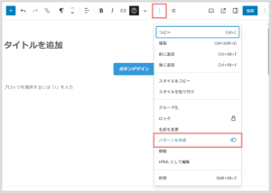

新規パターンの追加画面が表示されたら、以下を設定して「追加」ボタンをクリックしてください。
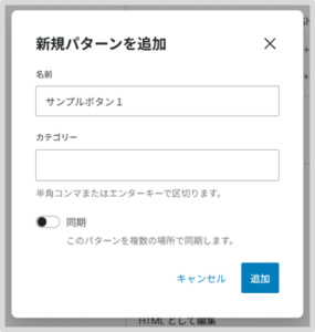

- 名称:好きな名前を入力
- カテゴリー:空白
- 同期:OFF
これで「ボタン装飾」が非同期パターンに登録されました!
STEP
登録した囲い枠を呼び出して使用する
先ほど登録したボタンを呼び出してみましょう。
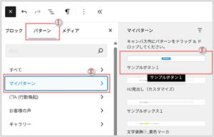
投稿ページ左上の ボタンをクリックします。
「パターン」タブを開き、マイパターンから「STEP2で登録したボタン装飾」を選択したら、登録したボタンが挿入されます!

お疲れさまでした!これでボタン装飾の登録から適用までの手順は完了です!
この方法で一度登録してしまえば、次回からはボタン一つで簡単に使えますよ。
この記事の内容は以上となります。
~ 最後に ~
この記事では、テーマやプラグインなしでおしゃれな「ボタン」を実装する方法を紹介いたしました。
HTMLコードをコピペするだけで取り入れられるので、用途に応じてお気軽にご利用いただけます。
また、このコンテンツ以外にも、装飾パーツごとに「デザインのまとめ記事」を公開しているので、ぜひチェックしてみてください。
~ こちらの記事もおすすめ ~
.Webページのパーツごとに、多彩なデザインを提供しています!装飾を探している人はぜひ活用してみてください。.
.Webページをオシャレにしたい人は必見です!デザイン初心者がプロ並みのサイトを作るコツをお伝えします。.
\シェアしてくれたらうれしいです!/
 ボタンをクリックします。